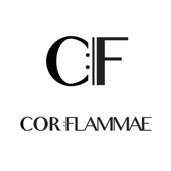
I’m doing the print design for a very exciting new project that’s in the works. Cor Flammae is Vancouver’s budding classical music chorus of queer singers performing queer content. The goal is to shed light on the often obscured histories of LGBT musicians, bringing their music to life in context with their stories, and linking them to the living tradition of contemporary queer composers.
So. How do you say that in a logo? The logo uses the repeat sign from music notation as the symbolic element – Cor Flammae looks at the past while moving forward. I chose to use a mixture of serif and sans-serif fonts to give both a historical and contemporary feel to the image. Since the choir aims to present historical works as immediately relevant, I wanted to create a cohesive mixture of visual elements that aligns with this vision.
From a technical perspective, it’s important to create a logo to work vertically and horizontally, small and large, and in dark and light, so I’ve created versions that keep the visual consistency, but can work in multiple scenarios. It’s been used all over Facebook and Twitter, YouTube, posters, flyers and even a hand stamp, translating easily from medium to medium. I’m pretty happy with the outcome.
