logos

Studio 209 – Logo & Business Cards

Recently, I got to work on logo creation again, this time for Studio 209 salon! Since the salon is in a heritage building, we wanted to pull an antique feel into the logo, going with a beautiful serif font, a soft grey and inverse rounded corners. I created a square and long version, since a logo needs to be flexible and translate regardless of size or where it’s being used. So far they’ve been used in a window cling for the front door, the website and the business cards.

In my designs everything should relate to a single idea or inspiration, and for Studio 209 that cornerstone is the physical space. Every business in this heritage building has gorgeous frosted glass doors and hallway walls, each with its own unique pattern. For the business card, I took a photo of the salon’s door – its luminous champagne coloured “fingerprint” – to use as the background, welcoming you in to the warm environment inside.

Genderfest 2014!

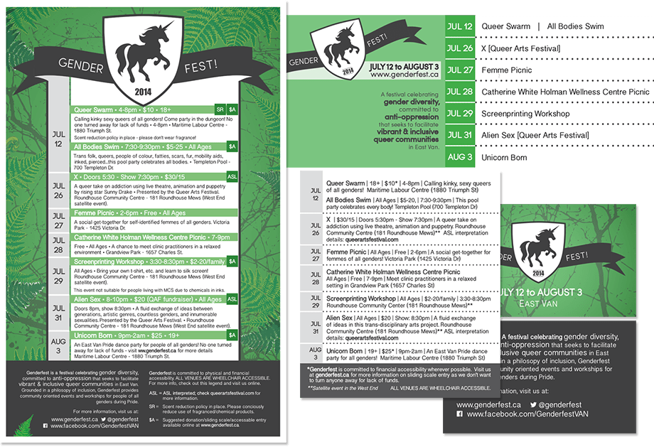
It’s time for this year’s Genderfest!  Genderfest is an East Van celebration of queer pride, that brings together a bunch of great events that celebrate gender diversity.  It’s a festival I really believe in and I was so pleased to be asked back this year to do the promotional graphics!

We put together a poster listing all the events, with a luscious west coast background, which I got to use my wacom tablet to draw some ferns for.  I also had a blast creating an alternate interpretation of the Genderfest unicorn logo into a simplified banner image, and update the website background to match. Expanding the web graphics side of things from last year, the Facebook banner I created lists all the events and describes the festival, in case folks want a quick cheat-sheet of what’s going on.  The really cool part of this year’s promotions is a folding business card with all of the event listings. The idea is that instead of having a bulky flyer that people toss away or tape to their fridge at home, this is something they can carry around in their wallet and open it up when they’re out on the town.

The final Genderfest event is Unicorn Born – an epic East Van dance party (19+) happening this Sunday at the Maritime Labour Centre (1880 Triumph St).  Check out the Genderfest website for Unicorn Born accessibility information.  I’ll see you there with my dancing shoes on!


Genderfest Campaign 2014


Logopalooza

I’m doing the print design for a very exciting new project that’s in the works. Cor Flammae is Vancouver’s budding classical music chorus of queer singers performing queer content. The goal is to shed light on the often obscured histories of LGBT musicians, bringing their music to life in context with their stories, and linking them to the living tradition of contemporary queer composers.

So. How do you say that in a logo? The logo uses the repeat sign from music notation as the symbolic element – Cor Flammae looks at the past while moving forward. I chose to use a mixture of serif and sans-serif fonts to give both a historical and contemporary feel to the image. Since the choir aims to present historical works as immediately relevant, I wanted to create a cohesive mixture of visual elements that aligns with this vision.

From a technical perspective, it’s important to create a logo to work vertically and horizontally, small and large, and in dark and light, so I’ve created versions that keep the visual consistency, but can work in multiple scenarios. It’s been used all over Facebook and Twitter, YouTube, posters, flyers and even a hand stamp, translating easily from medium to medium. I’m pretty happy with the outcome.