Springtime Rhapsody

In honour of the hail today, I’m posting a recent poster I did for the North Shore Chorus’ spring concert! They wanted something with riotous spring colour, but rather than go a literal route of flowers I found this gorgeous painting to use as a background. I hope the cherry blossoms that have been peeking out this week survive today’s weather!

CD Jacket & Social Media for The Argyle Embargo’s Debut Album

I’m so excited to be able to share the project I’ve been working on this January! Local Vancouver band, The Argyle Embargo, released their first album last night, and took me on to do the CD and jacket design. It was one of those lightning fast projects, where I had to collaborate with the band and the photographer to get everything done in time for the release, and we all pulled together to make something awesome. I’m so happy with the experience and the final product!

They also had me do a campaign of social media images to promote the album and the show. I love the challenge of translating a look and feel across different dimensions and platforms. Here are the ones I did for Facebook, Soundcloud, and Twitter.

A huge congratulations to the Embargo on a packed show and a rocking first album! Looking forward to the next one!


Yuletide Fires

‘Tis the season of choral music, and I was pleased to do another holiday concert poster for the North Shore Chorus.  They asked for an old-fashioned Christmas feel, so I had a lot of fun finding the right font to evoke a heritage feel from the rustic background we selected. Blending a mixture of a charming serif for the title with the modern typeface we use on all North Shore Chorus posters for the concert details, creates a unique character for this poster while maintaining a sense of brand consistency.

Wishing happy holidays to everyone — here’s to all the sounds and sights of the season!

YuletideFires_Web

Et Amor Retrospective

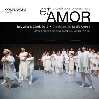
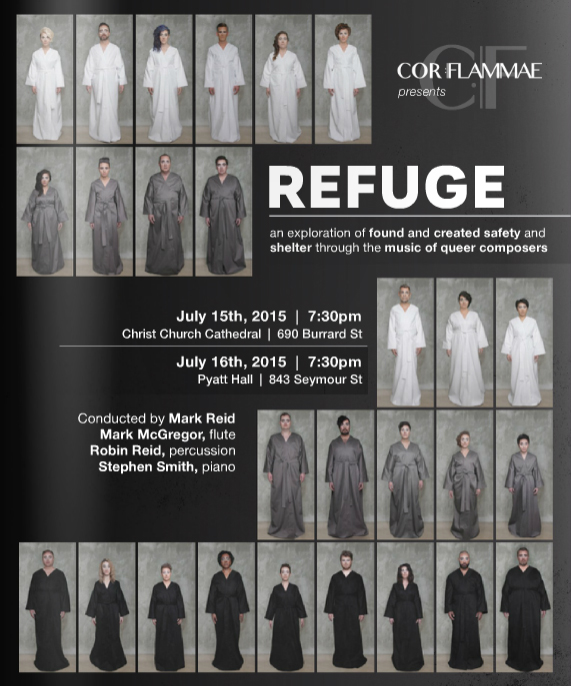
Another great Cor Flammae season has come to an end. This year we were joined by conductor and composer Leslie Uyeda, who’s work inspired the formation of our choir, so it was an amazing dream come true to work with her. She brought her years of choral and opera expertise to the project, and we were privileged to have her directing the ensemble.

Our 2017 etAMOR concert was another return, to the beginning of the queer story, to love. Queer liberation begins with love – our struggle to love openly and without persecution, and to love ourselves when the world tells us we are unlovable for being different. To think about love from a queer perspective is to accept heartache, loss and danger alongside joy, hidden treasures, self-discovery, community and survival. In seeking to love openly, we have found others like us, and created this imperfect and beautiful community in which we care for one another.

One of my favourite parts of my Cor Flammae work is writing and designing the programme, which the paragraph above is a sample from. Check out the full publication on issuu.com:


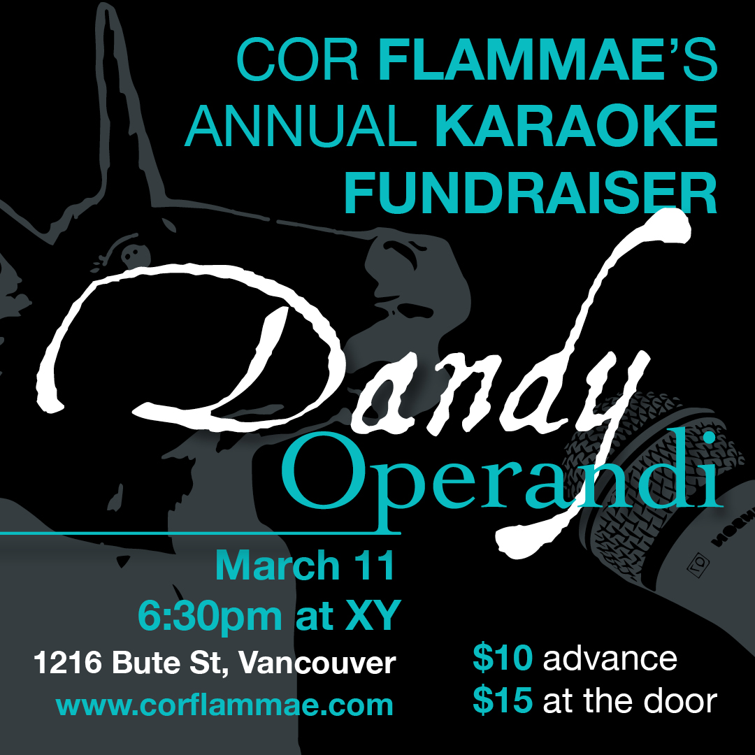
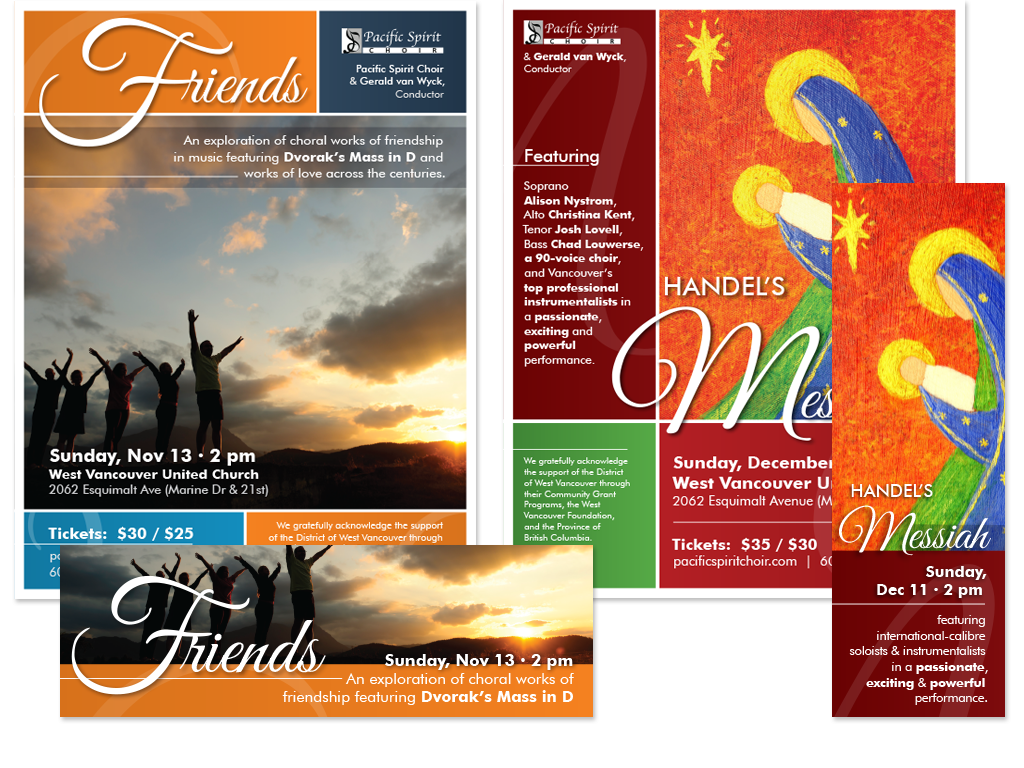
It was lots of fun to do all the usual collateral for the season too! From audition posters, to fundraising graphics and the event poster, it’s so great to do a whole campaign from start to finish. I even got to film and edit this year’s YouTube videos!  It was an amazing season – our best yet – and I’m so proud to have had a part in it!


Pacific Spirit Choir: Fall & Winter Posters

For their 2016 fall and winter concerts, I created a unified theme for the Pacific Spirit Choir posters. Using different kinds of stock images, I kept a consistent look with the large rectangular panels, and bold colour gradients. Each poster had to be re-interpreted as a bookmark as well, adapting the elements of the larger image to a smaller, narrower area while retaining the legibility and feel of the original. I’m looking forward to taking this same style into their spring concert poster for a fully cohesive 2016/17 season!

pacificspiritchoirfall2016


REFUGE Recap

The dust has finally settled after the July Cor Flammae concerts, and we are so pleased to have another successful summer concert series under our belts, and grateful for the artistic experience that came together.

When we chose REFUGE as a theme, it was months before the terrible events at Pulse Nightclub in Florida occurred, but rehearsing in the aftermath we were reminded of why we do what we do. Providing a space for queer singers to make art about survival, and providing a space of meditation on this experience for audiences, is not just an academic exercise but something necessary and artistically relevant to our lives. The point of art is to reflect, parse, transform and bear witness to the realities of the human experience. When people question “why queer art,” this year’s concert allowed us to answer that the queer experience needs to be heard and seen – queer art is a shelter;  one that both saves us from the world and allows us to remake it with more room for difference. In making art about the queer experience we do as we always aspire to – connect the abstract beauty of music to that vital heartbeat of human life.

On that note, this year’s programme was a special undertaking. Learning about music history brings the pieces and composers to life for me, not only letting me geek out and expand my own knowledge, but also explore my favourite challenge: how to then translate that experience to the reader. My hope is that it works in concert with the performances to allow listeners to fully engage with this music.

You can find the programme at issuu.com, and recordings of this summer’s performances at bandcamp.com and YouTube.

refugecover

Every thing is fine and Dandy Operandi

OMG! I’m so stoked to the 2016 graphic design campaign for Cor Flammae! Preparations for this Summer’s concerts are heating up, and now that repertoire selection and auditions are done it’s fundraiser time! The initial web graphics for our annual shindig are out in the world, along with the revamped and sexy sponsorship packages.

[You may noticed we’ve bid Dandycat a fond adieu, and welcomed this suave and sophisticated unicorn as our ambassador of FUNdraising. Join us on Tuesday, April 19th at XYYVR (1216 Bute St) to party like a unicorn! Tickets available here! Get them for cheaper if you buy them in advance! Find out more on Facebook.]

That got me thinking that I’m not sure if I’ve made a comprehensive list of my Cor Flammae design projects anywhere. Here’s what I’m doing this year:

  • Audition posters
  • Conductor interview filming
  • Thank you cards & Donor download cards
  • Sponsorship package dandification
  • Dandy Operandi web graphics, flyers and posters
  • Concert web graphics, flyers and posters
  • Concert programme (one of my favourite parts, as you know from previous posts)

The fun additions this year, include the initial conductor interview (which I filmed on my DSLR) and more graphics for the online campaigns – making images specifically for Instagram and Universe, in addition to the pieces for Facebook, YouTube and Bandcamp that we did last year. It’s wonderful to be able to broaden my skills by rounding out the campaign. I think this year’s campaign is forming into something clean, articulate and visually lush while still being fun – thanks in a large part to the great photos we have of previous years (which is another kind of satisfying). I can’t wait to get my hands on this year’s choir photo – styled by the amazing Missy Clarkson and Adam Dickson –  and take off with this year’s concert materials!


Rossini’s Petite Messe Solenelle

I’m pleased as punch to have put together the spring concert poster for the Richmond Orchestra and Chorus Association and the North Shore Chorus’ spring collaboration.  They will perform two concerts of one of Rossini’s sacred works, the Petite Messe Solennelle, on March 12th and April 2nd.

RossiniPosterROCA_Web

I had a lot of fun with this one – I did a sketch of a Rossini portrait to use as my background and then scanned it in to my computer, where I changed it into a vector image in Illustrator.  I had recently got my hands on some new fonts, and I enjoyed playing with the contrast between the script font of the composer name, and the bold modernity of the title text.  I hope it references the traditional aesthetic associated with classical music, and the joyous, expressive energy that comes to mind when I think of Rossini, but with a clean, contemporary feel.

Cutathon Fundraiser for Refugees – Jan 18th

The Vancouver Hairstylist Community is putting on a fundraiser to benefit refugees coming to BC! On January 18th get your hair cut by donation (minimum $35, but sky’s the limit) at one of 8 fabulous salons, and all the proceeds will go to the Immigrant Services Society of BC to help with their amazing work helping refugees settle here.

Look fabulous and feel even better! Do your part by getting a new ‘do!  Find out more on Facebook or  call up one of the participating salons:

Barbarella hair saloon
3277 Main St | 604.876.1414
www.barbarellahair.com

The Beehive Hair Lounge
3904 Fraser St | 604.709.9928
www.beehivehairlounge.ca

Big Joy Barber & Salon
203-2132 East Hastings St | 604.562.3443
www.bigjoybarberandsalon.com

Coup Salon
524 Shanghai Alley | 604.688.2227
www.coupsalon.ca

Citrus Hair Salon
1036 Mainland St | 604.688.1332
citrushairsalon.com

THE DYE LOT
63 & 65 Lonsdale Ave, North Van
778.340.3332 | the-dye-lot.com

JOY
202-123 Carrie Cates Ct, North Van
604.990.0123 | www.joyhairstudio.com

Studio 209
209-402 West Pender St | 604.915.9170
www.studio209hair.com

I was stoked to do my part by designing the poster! Creating the heart shears dreamed up by Vancouver Hairstylist Community founder, Missy Clarkson, was loads of fun, and exploring a different look and feel from my usual work was a great chance to stretch creatively.