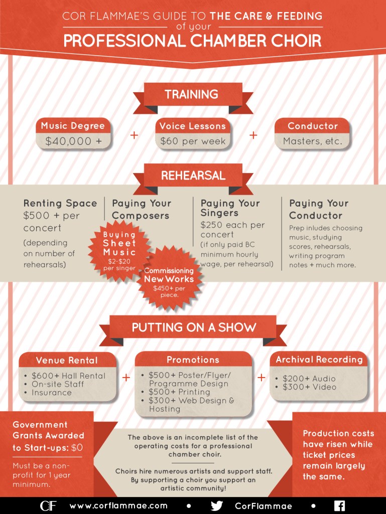
I love a good infographic – they’re the perfect example of what design is really about: using form to enhance function. As a visual learner, I also really appreciate seeing how a thing works. They’re tricky business, because it’s not just about making information pleasing to the eye, but organizing it – deciding which information should be highlighted so it can be presented in a succinct way that provides insight for the viewer.
I made this infographic for Cor Flammae’s fundraising campaign. The arts are notoriously under-funded, but we wanted to show the specifics of how under-funded professional choral music is, by highlighting what goes in to producing a show. It is meant to be useful to other choirs as well, and it was an interesting process of research and collaboration, whittling down the information into something that does justice to an experience shared by many groups and then deciding how best to present it in an easily-readable form that fit in a browser window or on a small poster.
