Poster

Springtime Rhapsody

In honour of the hail today, I’m posting a recent poster I did for the North Shore Chorus’ spring concert! They wanted something with riotous spring colour, but rather than go a literal route of flowers I found this gorgeous painting to use as a background. I hope the cherry blossoms that have been peeking out this week survive today’s weather!

Pacific Spirit Choir: Fall & Winter Posters

For their 2016 fall and winter concerts, I created a unified theme for the Pacific Spirit Choir posters. Using different kinds of stock images, I kept a consistent look with the large rectangular panels, and bold colour gradients. Each poster had to be re-interpreted as a bookmark as well, adapting the elements of the larger image to a smaller, narrower area while retaining the legibility and feel of the original. I’m looking forward to taking this same style into their spring concert poster for a fully cohesive 2016/17 season!

pacificspiritchoirfall2016


Rossini’s Petite Messe Solenelle

I’m pleased as punch to have put together the spring concert poster for the Richmond Orchestra and Chorus Association and the North Shore Chorus’ spring collaboration.  They will perform two concerts of one of Rossini’s sacred works, the Petite Messe Solennelle, on March 12th and April 2nd.

RossiniPosterROCA_Web

I had a lot of fun with this one – I did a sketch of a Rossini portrait to use as my background and then scanned it in to my computer, where I changed it into a vector image in Illustrator.  I had recently got my hands on some new fonts, and I enjoyed playing with the contrast between the script font of the composer name, and the bold modernity of the title text.  I hope it references the traditional aesthetic associated with classical music, and the joyous, expressive energy that comes to mind when I think of Rossini, but with a clean, contemporary feel.

‘Tis the season of song!

Whether sacred or festive music, ’tis the season to enjoy a smorgasbord of aural delights. There’s nothing that better embodies the spirit of gathering together to celebrate joy in the bleak midwinter than choral music!

I’m happy to have done the posters for two holiday concerts this year. If you’re on the North Shore and in need of seasonal song the weekend of December 5th and 6th, check them out! If you want something to get you in the holiday mood on Saturday night, The North Shore Chorus and the Carousel Chorus are teaming up to perform a selection of festive jazz music. For some seriously jubilant classical repertoire, check out the Pacific Spirit Choir on Sunday afternoon, with their performance of Vivaldi’s Gloria, and Bach’s Magnificat.


Cor Flammae Promo Poster is Printed!

The posters and flyers for Cor Flammae are home from the printer and I couldn’t be more pleased. There’s nothing like holding the real things in your hands, and it’s amazing to realize that it’s almost showtime!  It was a real treat working with the fabulous image of the choir shot by the talented team at belle ancell photography.  Now to distribute these puppies all over Vancouver!

Cor Flammae Print Promotions

Neither/Nor at the Ayden Gallery

I just did a poster and flyer for the Ayden Gallery’s upcoming exhibition, Neither/Nor. It was a total pleasure working with the gorgeous images of these wonderful artists:

CHRIS ANDERSON / AMANDA ARCURI / MARIANE BOURCHEIX-LAPORTE / EMILY COOPER / BRITTA FLUEVOG / KATY HUCKSON / ROKSAN KOHEN / TONI LATOUR / MARYAM SAFA / LISA SIMPSON/ DEREK VON ESSEN / KATJA ZUBROWKA

The opening reception is July 4th, 7-11pm, and will feature performances and live music. If  you’re looking for something to do this coming Friday, wander down to the Ayden Gallery (2nd Floor, International Village – 88 West Pender Street) and check out this great show!

NeitherNor

O Fortuna!

My latest piece for the North Shore Chorus promoted their end-of-season concert featuring selections from that quintessentially epic composition, Carmina Burana.  Carmina is a delightful anachronism, being a 20th century composition set to a collection of poems from the 11th to 13th centuries.  For me, it is less about re-creating something authentic from the past, than seeking to present its truth by using the immediacy of contemporary terms.   That being said, there is also a tradition of images associated with it, and I decided to go with the ever popular wheel of fortune, an adaptation from the original 1936 score – and the original Codex Burana manuscript in turn.  I decided to play around with some texture as well, to enhance the aged feel, as well as a rich red to play off the visceral sensuality (plus, there’s a play on words with “carmina” [songs] and “carmine” [red] somewhere in there).

Image


The Whole Enchilada

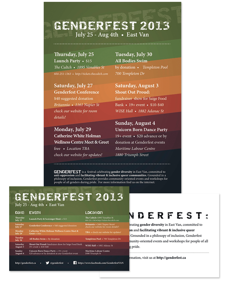
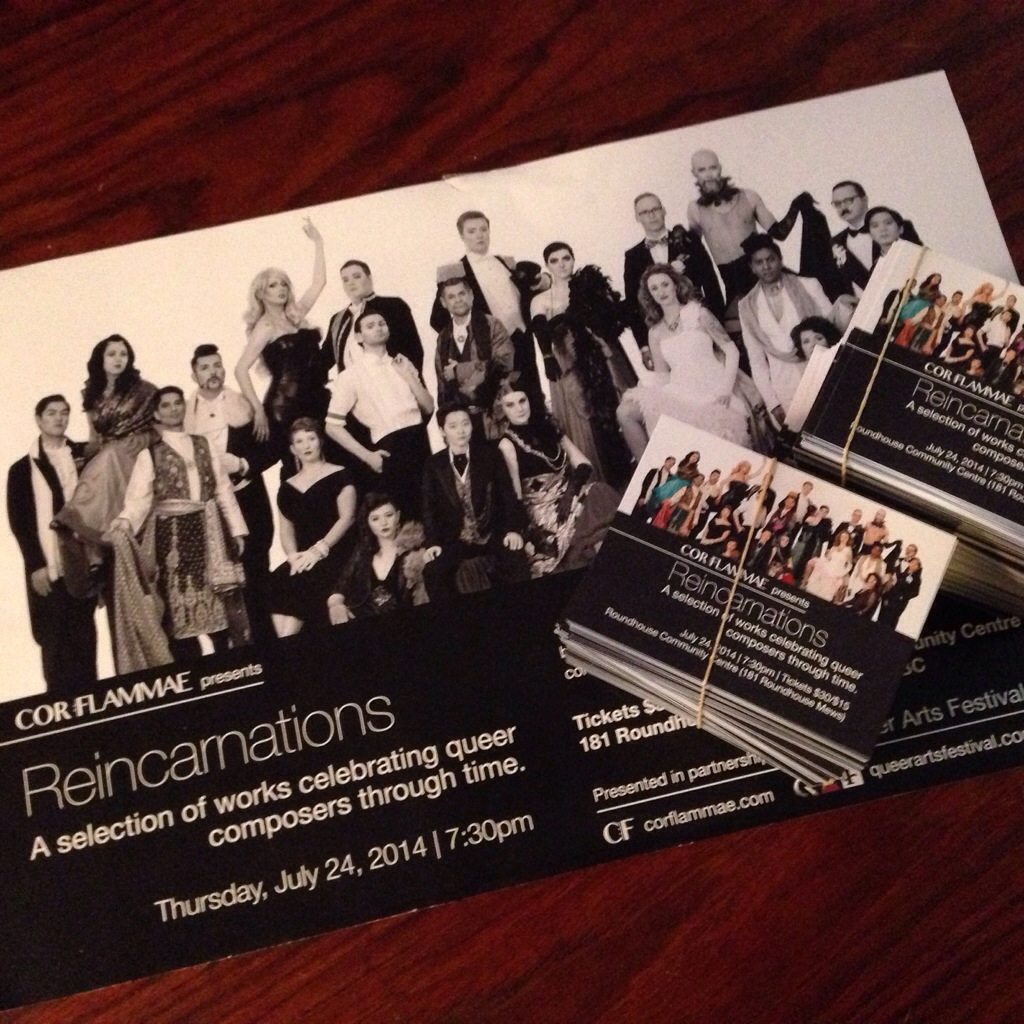
I recently had the great pleasure of designing the print campaign for Genderfest.  This involved a poster, several ads for the Pride Guide, as well as a flyer.

As it was a multi-day event with lots of information I really needed to use the flyer’s real-estate to it’s fullest.  Instead of just advertising the festival as a whole, I wanted to have the relevant “who”, “what”, “when”, and “where” fully available for all of the festivities – essentially for the flyer to be something people would pick up and keep like an event guide.  Genderfest already had a website, and the layered colour scheme was their background image – it was the perfect visual element I could lend to structuring  information.  Rotating the image created some visual interest for the poster, which needed a different kind of structure to keep the test bold and visible from a distance.

Working with the Genderfest team was a joy and I’m so excited for next year!  Check out the awesome work they do at www.genderfest.ca

Genderfest Campaign

Poster Time

So I made another thing! This is poster number three for the North Shore Chorus, a local community choir.  Their program featured a celestial theme, so I recreated a night sky.

Normally, I do a lot of text-based work – using fonts as a graphic element in combination with photos. Part of my day job is to do layout, so it’s a natural step for me. This time, however, I got to bust out my Wacom digital drawing tablet and make some original art. Doing the detail of the moon and the reflection was super fun. Can’t wait for more!

Shining Night Poster