design

CD Jacket & Social Media for The Argyle Embargo’s Debut Album

I’m so excited to be able to share the project I’ve been working on this January! Local Vancouver band, The Argyle Embargo, released their first album last night, and took me on to do the CD and jacket design. It was one of those lightning fast projects, where I had to collaborate with the band and the photographer to get everything done in time for the release, and we all pulled together to make something awesome. I’m so happy with the experience and the final product!

They also had me do a campaign of social media images to promote the album and the show. I love the challenge of translating a look and feel across different dimensions and platforms. Here are the ones I did for Facebook, Soundcloud, and Twitter.

A huge congratulations to the Embargo on a packed show and a rocking first album! Looking forward to the next one!


REFUGE Recap

The dust has finally settled after the July Cor Flammae concerts, and we are so pleased to have another successful summer concert series under our belts, and grateful for the artistic experience that came together.

When we chose REFUGE as a theme, it was months before the terrible events at Pulse Nightclub in Florida occurred, but rehearsing in the aftermath we were reminded of why we do what we do. Providing a space for queer singers to make art about survival, and providing a space of meditation on this experience for audiences, is not just an academic exercise but something necessary and artistically relevant to our lives. The point of art is to reflect, parse, transform and bear witness to the realities of the human experience. When people question “why queer art,” this year’s concert allowed us to answer that the queer experience needs to be heard and seen – queer art is a shelter;  one that both saves us from the world and allows us to remake it with more room for difference. In making art about the queer experience we do as we always aspire to – connect the abstract beauty of music to that vital heartbeat of human life.

On that note, this year’s programme was a special undertaking. Learning about music history brings the pieces and composers to life for me, not only letting me geek out and expand my own knowledge, but also explore my favourite challenge: how to then translate that experience to the reader. My hope is that it works in concert with the performances to allow listeners to fully engage with this music.

You can find the programme at issuu.com, and recordings of this summer’s performances at bandcamp.com and YouTube.

refugecover

Every thing is fine and Dandy Operandi

OMG! I’m so stoked to the 2016 graphic design campaign for Cor Flammae! Preparations for this Summer’s concerts are heating up, and now that repertoire selection and auditions are done it’s fundraiser time! The initial web graphics for our annual shindig are out in the world, along with the revamped and sexy sponsorship packages.

[You may noticed we’ve bid Dandycat a fond adieu, and welcomed this suave and sophisticated unicorn as our ambassador of FUNdraising. Join us on Tuesday, April 19th at XYYVR (1216 Bute St) to party like a unicorn! Tickets available here! Get them for cheaper if you buy them in advance! Find out more on Facebook.]

That got me thinking that I’m not sure if I’ve made a comprehensive list of my Cor Flammae design projects anywhere. Here’s what I’m doing this year:

  • Audition posters
  • Conductor interview filming
  • Thank you cards & Donor download cards
  • Sponsorship package dandification
  • Dandy Operandi web graphics, flyers and posters
  • Concert web graphics, flyers and posters
  • Concert programme (one of my favourite parts, as you know from previous posts)

The fun additions this year, include the initial conductor interview (which I filmed on my DSLR) and more graphics for the online campaigns – making images specifically for Instagram and Universe, in addition to the pieces for Facebook, YouTube and Bandcamp that we did last year. It’s wonderful to be able to broaden my skills by rounding out the campaign. I think this year’s campaign is forming into something clean, articulate and visually lush while still being fun – thanks in a large part to the great photos we have of previous years (which is another kind of satisfying). I can’t wait to get my hands on this year’s choir photo – styled by the amazing Missy Clarkson and Adam Dickson –  and take off with this year’s concert materials!


Rossini’s Petite Messe Solenelle

I’m pleased as punch to have put together the spring concert poster for the Richmond Orchestra and Chorus Association and the North Shore Chorus’ spring collaboration.  They will perform two concerts of one of Rossini’s sacred works, the Petite Messe Solennelle, on March 12th and April 2nd.

RossiniPosterROCA_Web

I had a lot of fun with this one – I did a sketch of a Rossini portrait to use as my background and then scanned it in to my computer, where I changed it into a vector image in Illustrator.  I had recently got my hands on some new fonts, and I enjoyed playing with the contrast between the script font of the composer name, and the bold modernity of the title text.  I hope it references the traditional aesthetic associated with classical music, and the joyous, expressive energy that comes to mind when I think of Rossini, but with a clean, contemporary feel.

Cor Flammae 2015 Design

I’m so excited to be working on the Cor Flammae 2015 marketing materials! Using this year’s lovely image photographed by belle ancell and designed by Adam Dickson and Missy Clarkson, I’ve created YouTube, Facebook and flyer images utilizing a consistent look and feel across these different mediums, and made dark and light versions with a related aesthetic.  I’m looking forward to getting the poster out in June!

The YouTube, Facebook event and flyer graphics for the 2015 Cor Flammae summer season.

The YouTube, Facebook event and flyer graphics for the 2015 Cor Flammae summer season.

Reincarnations: reflecting on the Cor Flammae 2014 Programme

ReincarnationsProgramme

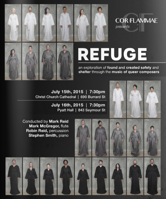
Last year I had the immensely rewarding and transformative experience of helping bring a new ensemble to life, as part of the Cor Flammae administrative team.  If you haven’t seen my previous posts, Cor Flammae is a classical music choral ensemble aiming to celebrate queer composers and vocalists – the only one of it’s kind in Canada – and I’m happy to report we completed it’s inaugural concert to a hungry and excited audience.  We sold out 250 seats, and had to turn away another 100.  There were even scalpers, which pretty much never happens in classical music.

I have been a life-long choral music audience member, with an ever growing  interest in the world of arts admin, and a fascination with the puzzle of how to generate the positive feedback loop of audience engagement and participation that makes a stable arts venture.  It was with great delight that I lent my abilities with a keyboard and a pencil to the Cor Flammae effort, jumping into the tasks of fundraising and print design.  Audition posters, fundraising graphics, thank you cards and concert posters were all fun ways to engage and hopefully inspire folks to be singers, patrons and philanthropists for this brand spanking new choral group.  Working on the branding vision with the choir’s Managing Director (my lovely and multi-talented wife) Missy Clarkson, we wanted something clean and modern, that would both reflect the seriousness of the talent and the music involved in the project, as well as create a fresh and contemporary appeal.  Inviting people into this project, whether they were classical music people or totally new to the world of choir, is a core value for us – this project has purpose and something to say, new art to make, and we want to share an angle that hasn’t yet had much real-time application (though there is quite a bit of interesting scholarship on queer musicology  – Queering the Pitch is a fascinating read) with anyone who would be interested.  This also lead me to my favourite part of the project, the programme.

I’ve designed programmes before, but the great joy of the Cor Flammae programme was the copywriting I did in addition to layout. Researching the amazing composers, building off the bios Missy had compiled on the website, and trying to synthesize something we could share with the audience about their contexts, music and personal stories that would illuminate the concert experience was both an incredible deepening of my own knowledge, as well as a chance to geek-out as a writer and flex my academic training.

It was a wonderful experience, and now we’re looking forward to creating the same magic for the summer of 2015.  Performances are on July 17th and 18th, when we’ll be performing an incendiary concert of sacred and profane works by queer composers.  Come check us out!

The Whole Enchilada

I recently had the great pleasure of designing the print campaign for Genderfest.  This involved a poster, several ads for the Pride Guide, as well as a flyer.

As it was a multi-day event with lots of information I really needed to use the flyer’s real-estate to it’s fullest.  Instead of just advertising the festival as a whole, I wanted to have the relevant “who”, “what”, “when”, and “where” fully available for all of the festivities – essentially for the flyer to be something people would pick up and keep like an event guide.  Genderfest already had a website, and the layered colour scheme was their background image – it was the perfect visual element I could lend to structuring  information.  Rotating the image created some visual interest for the poster, which needed a different kind of structure to keep the test bold and visible from a distance.

Working with the Genderfest team was a joy and I’m so excited for next year!  Check out the awesome work they do at www.genderfest.ca

Genderfest Campaign

Album Realization

I am so excited to have finished my very first jewel case design! I’ve been doing layout of printed booklets for a while, but it’s definitely a thrill branching out into a slightly different format – one I can pick up, open and put in my CD player! A big thank-you to the North Shore Chorus for bringing me on to this project!

20130506-093155.jpg

20130506-093216.jpg